
Brighton Science
BEFORE:
Reports didn’t exist in Brighton Science’s web app.
AFTER:
Designed prototype for first reports homepage within their web app.
ROLE: UX Designer
TEAM: Cross-functional collaboration between engineering, product, and designers
SKILL FOCUS: Ideation - Quick Sketching & Annotated Wireframes - Prioritization
CONTRIBUTION: Out of 30 design iterations, Product team moved forward with my unique feature recommendations. Currently being implemented (launching January 2025) with the goal of boosting customer retention and brand loyalty.
(click the expanding arrows in the top right corner to try the prototype for yourself!)
UNDERSTANDING THE CLIENT
TL:DR
Problem: Customers can’t immediately use product because of arduous pre-tests
Solution: Automate the pre-tesing within the web app so customers can use product sooner
Brighton Science’s primary product, the Surface Analyst, is a cloud-connected handheld device that sprays a small stream of water to measure the water contact angle using patented technology. The Surface Analyst transmits measurements to a web interface for reporting on individual or batch results and offers a desktop interface for managing experiments prior to surface treatments.
The Problem Space:
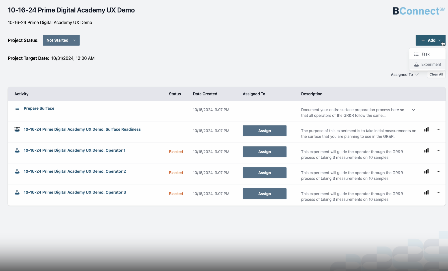
Currently, the results of each of the 3 individual experiments are viewable in their own separate results page, but there is no view that shows all results together and aggregated in the same view. This means that primary users have to create an excel spreadsheet and manually input hundreds of data points in order to evaluate whether or not their SA has passed the GR&R test. Manually creating an aggregated report can take days, if not weeks to complete.
In order for businesses to use the Surface Analyst (SA), they have to first run a Gage Repeatability & Reproducibility test (GR&R) to ensure the tool works properly.
Today, users can create a GR&R Project in the Brighton Science’s web app. The web app automatically creates 3 experiments and 1 task. Using the SA to take measurements, 3 appraisers complete each of the 3 experiments. The device then sends those measurements to the web app.
What are Stakeholders Looking to Accomplish?:
Brighton Science Stakeholder’s goal is to provide an accurate, repeatable, and nearly automatic process for aggregating experiment results in a GR&R report. It should indicate a clear pass/fail result and report details to the degree of which the individual user prefers.
RESEARCH PROCESS
TL:DR
Stakeholder Interview
Created Journey Map
Many Quick Sketches
Conducted a Kano Analysis
Collaborated with engineers to understand constraints
STAKEHOLDER INTERVIEW:
We conducted a 2 hour stakeholder interview with the Product Owner. We learned a lot about the customer and business perspective on why this feature was necessary.
Customer Perspective:
+ reduces GR&R evaluation time from days to minutes
+ removes human error from the tedious process of data compilation
+ provides clarity to assist with troubleshooting
Business Perspective:
+ puts Brighton Science at the forefront of innovation
+ builds additional credibility and trust within the manufacturing industry
Primary Users:
Quality Managers responsible for the quality control of a particular process. Many of these people are certified in six sigma (green belt or black belt)
Manufacturing workers (e.g., mechanics, technicians) taking measurements in context, looking to ensure the surface is ready for treatment and/or repair
Plant Managers responsible for the successful management of the plant, looking to understand and confirm daily operations
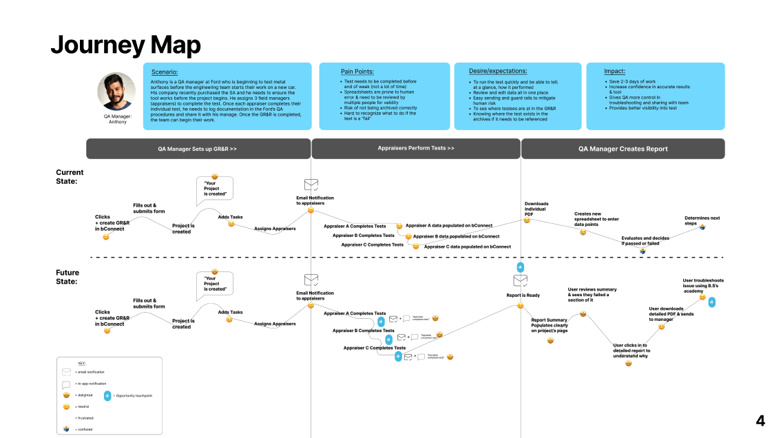
USER JOURNEY:
I created a journey map that highlights the current and future state of the GR&R workflow, highlighting pain points and happy points along the way.
Based on stakeholder interview, user journey, and IA diagram, approximately 75 new features were rapidly prototyped between me and additional designers on team. Here were my 5 concepts.
QUICK SKETCHING
(click to expand)
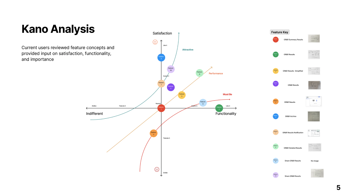
KANO ANALYSIS
The Kano Survey was sent to current users in the platform. They reviewed our feature concepts and provided input on satisfaction, functionality, and importance.
Kano Analysis graph, revealing survey results
Reviewing data from the Kano analysis proved to be incredibly insightful and was the basis for recommendations I provided in my annotated wireframes.
TECH SCOPING WORKSHOP
After doing a rapid prototyping sketch exercise, our design team met with the development team to discuss resource budget and restraints. We then dot voted, narrowing our 75 feature cards down to 10 plausible new features for Brighton Science.
Engineers discussed feasibility of initial sketches before we begun prototyping
RESEARCH FINDINGS:
Most users don’t need nor want to see all of the data, however, when they need to see it, it’s extremely important to review it
Results were currently not housed anywhere and it was not discussed in any of the feature concepts, however the additional feedback section of the Kano survey uncovered not only a need, but a possible opportunity to spark joy
Because this is a small task required to conduct before large projects, the results should be immediately understood
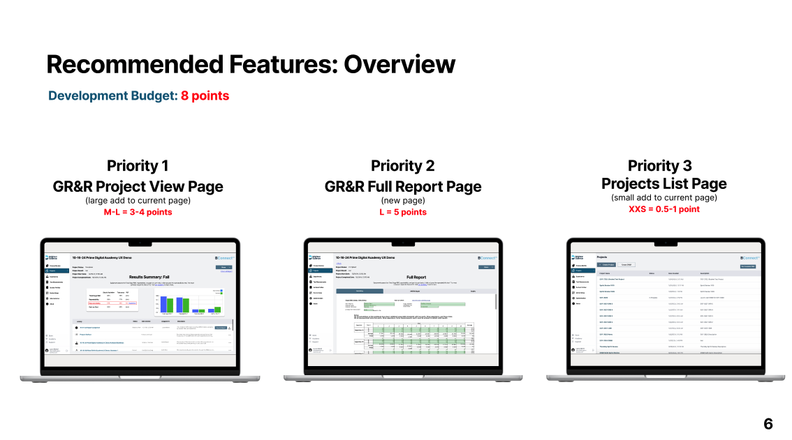
After analyzing research, I iterated on my sketched wireframes to create clearer concepts that solved the customer’s pain, met stakeholder’s goals, and stayed within development budget
END RESULTS
ANNOTATED WIREFRAMES:
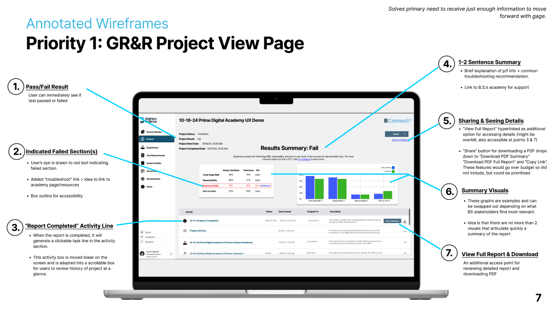
Wireframe 1: GR&R Project View Page
This first wireframe was crucial to get right because it needed to be clear enough for users to understand the results immediately and thorough enough to know where to look if the test failed.
Something that wasn’t mentioned in the stakeholder interview but was uncovered in the Kano analysis was the knowledge base Brighton Science already offered. I wanted to make sure to highlight this as an option that would make users feel supported by B.S.
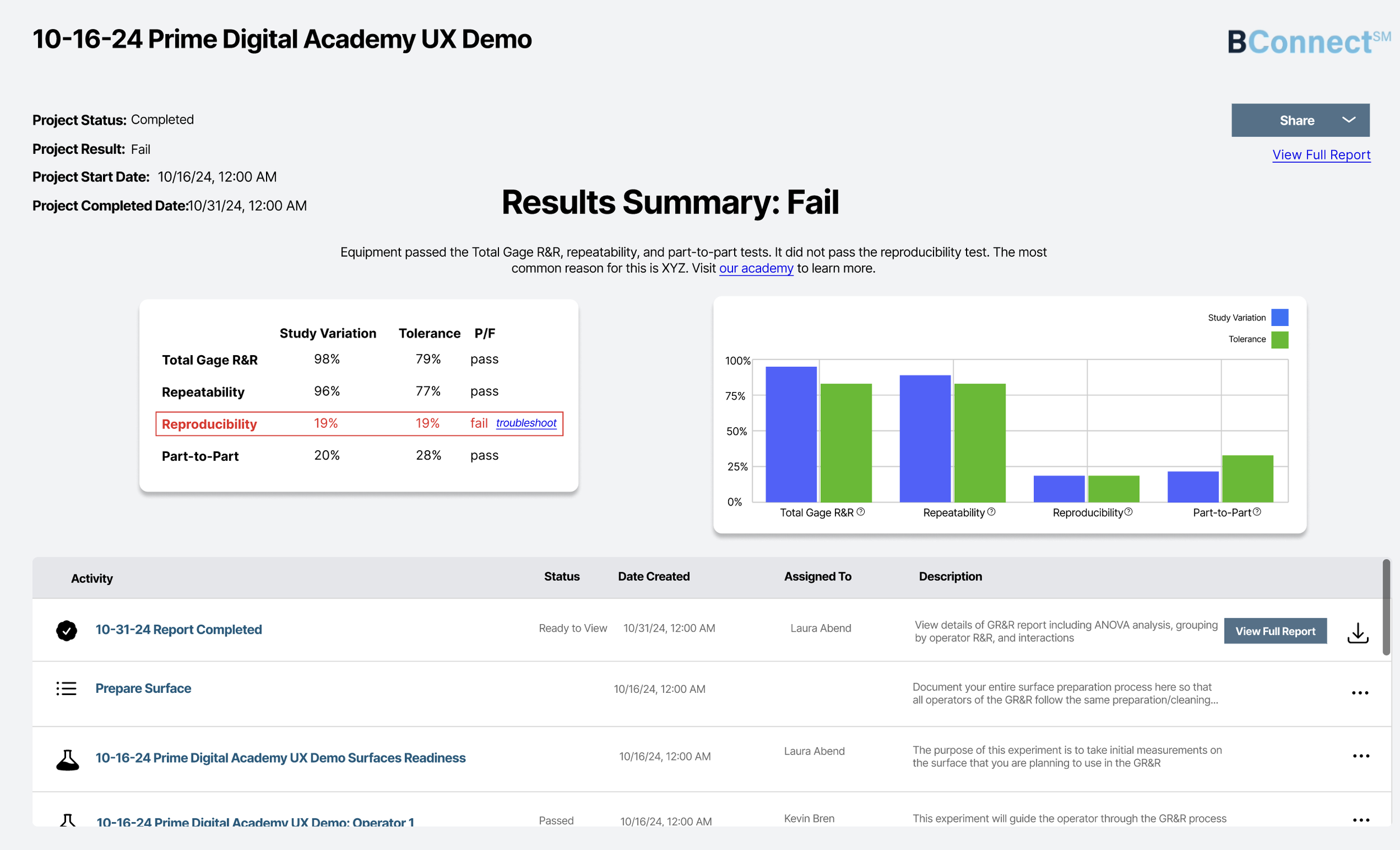
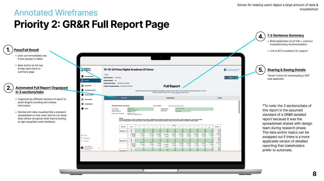
Wireframe 2: GR&R Full Report Page
Creating the full report wireframe was a challenge because of how much information there is and how much of it requires expert knowledge to understand.
I separated the full report into three digestible sections organized as tabs in a filing system. I organized it similar enough to the Results Page in order to allude to their connectedness.
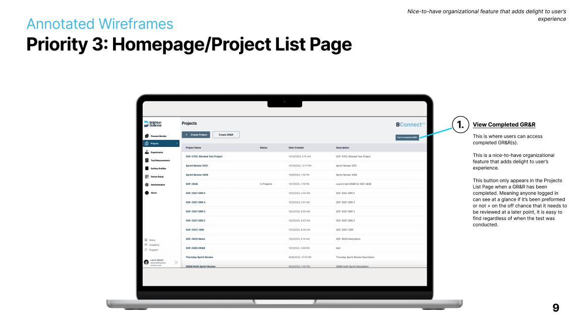
Wireframe 3: Homepage/Project List Page
The final wireframe was a simple add with a big impact: creating peace of mind in the user experience. I added a button to the homepage that clicks through to GR&R results, accomplishing two things:
Let’s other uses know a GR&R has been done (the button does not appear unless there are results that exist)
Makes it easy to find in the off-chance it' needs to be reviewed, no matter how long ago the test was conducted
DELIVERED TO CLIENT: MULTI-PAGE PDF


NEXT STEPS:
The recommended designs are currently being implemented by Brighton Science’s engineer team with a go-live date of January 2025.